I'm using Google Chrome more and more. In addition to my earlier gripe about password saving, there are various other perplexing design decisions. To me, none is more odd than Chrome's menu icons.
For Linux or Windows builds, Chrome/Chromium has no traditional "File/Edit/Tools/Whatever" menu headers, and instead uses a couple of icons on the toolbar:
Google apparently hates the old style menu bar, and rightfully so, since it steals valuable screen real estate from the in-browser apps that it thinks are the future of computing.* Google decides they want nothing to do with it in Chrome, but instead of creating something new (like MS has done with its "Ribbon"), they take those same old menu items and bury them into two "toolbar menus" represented by icons: a "rectangle with a triangle in the upper right corner" icon, and a "wrench" icon.
Right there, some alarm bells are going off. What is a rectangle icon? Is that the page? A document? What the hell is a wrench for? I've never used a wrench on a computer (well, there was that one time...). Based on its usage in other applications I can guess it means advanced settings or... something... right?
(Incidentally, Sun servers have a "wrench" light on them, which indicates they need... an oil change, I guess?)
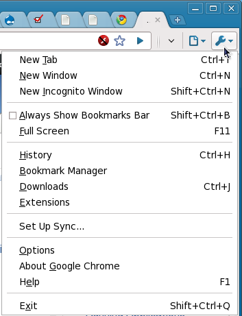
So, say you're a user staring at a Rectangle menu and a Wrench menu. Under which menu would you expect to find "Developer" menu options? Under which menu would you expect to open a new tab? (I'm aware that you can cheat by looking at my screenshot. Feel free, if that makes you feel better).
Answer: New tab is under wrench, developer is under rectangle. Clear as mud, right? Never mind that "wrench" normally means something like "tinkering" or "settings" or "change oil," and that the "rectangle" menu kinda looks like an empty document. We're in the google world now, it makes perfect sense!**
Of course, all those nasty menu items must go somewhere, and it's not exactly obvious where "somewhere" should be. Google probably figures they can just give the user a couple of obscure icons and let them work it out by the process of elimination. This is probably a valid assumption, but it doesn't make the icons themselves any less perplexing.
Bottom line: apparently, Google has solved the problem of incoherent menu bars - with incoherent toolbars. So... yay?